Fixing Onboarding by Reducing Uncertainty, Not Steps
The problem
Personalization sits at the center of Hoomanely. To deliver anything meaningful, especially breed-specific guidance, we needed users to share accurate profile details during onboarding: the pet's name, photo, breed, age, weight, and medical conditions.
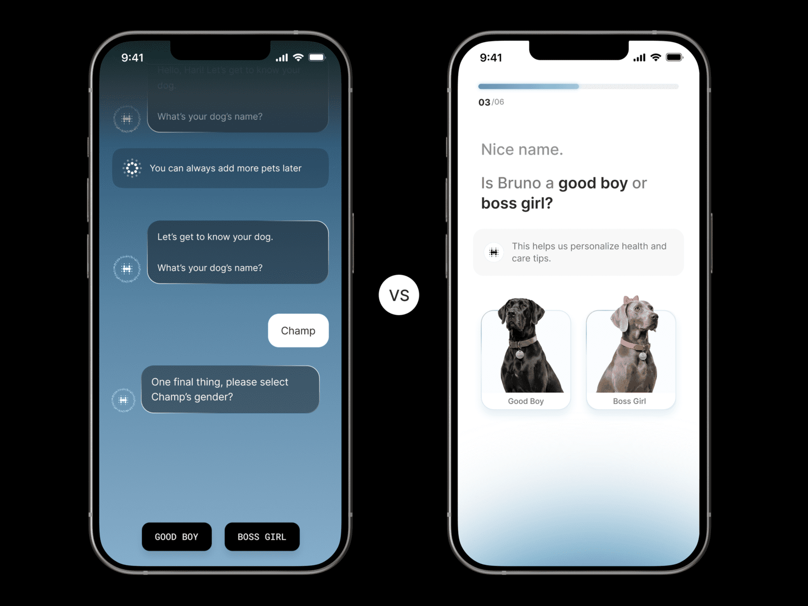
The original flow was designed to feel friendly, framed as a conversational, chat-style experience, almost like talking to an AI assistant. One question at a time. It asked for the pet's name, then prompted a photo upload so AI could guess the breed, and if the model wasn't confident, it asked the user to type the breed manually. That was followed by chat-style breed insights, then date of birth, weight, and medical conditions.
On paper this sounded engaging. In practice it introduced friction we hadn't fully anticipated. The numbers made that clear fast: onboarding completion hovered around 60 to 65%, and total completion time ran over two minutes, yet drop-offs happened at almost every step. That ruled speed out as the core problem. People were already spending the time, but uncertainty kept climbing with every new question.
What we saw was a growing sense of anxiety as the flow went on. Each new question showed up with no indication of how many were left. Users had no idea when onboarding would end, or what they'd get once it did. As we added more questions to strengthen personalization, the whole thing started to feel endless.
The real question was: how do we keep onboarding quick while still collecting what we need to personalize the Everwiz experience?
Approach
The obvious move would have been cutting questions or pushing data collection later. But personalization is core to Everwiz, and weak onboarding data weakens everything downstream, recommendations, insights, all of it.
So instead of asking what we could remove, we reframed the question: how do we make the same information feel easier to give? The focus shifted from cutting screens to cutting uncertainty. We believed people would finish onboarding if they knew how many steps were involved, could see their progress as they moved, and each input felt quick and purposeful.
Process
Understanding the drop-off pattern: drop-offs weren't concentrated on one specific step, they happened across almost every question, which pointed to a structural problem rather than a usability or complexity one. The chat interface made every question feel like it could be followed by many more. Conversations don't have a clear ending, and that ambiguity worked against people actually finishing the task.
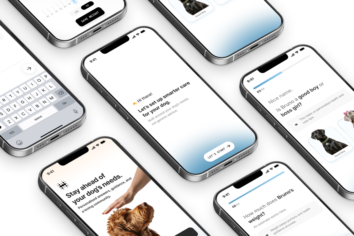
Moving away from chat-style: we decided to drop the conversational UI entirely. Onboarding isn't a conversation, it's a setup task. People weren't looking to chat with an AI, they wanted to finish setting up their profile. So we rebuilt the experience as a clear, step-based flow with a defined start and end.
Introducing progress visibility: we added a progress indicator showing the total number of steps, the current step, and how many were left. That alone cut a lot of the anxiety, people no longer had to wonder how long onboarding would take, they could just see it.
Reducing effort per step: we went through every question and cut friction wherever we could, minimizing steps without hurting personalization, using pre-selected inputs instead of free-text fields, redesigning date and weight pickers to be faster and more intuitive, and only using images where they added real value, like photo uploads for breed analysis. The goal wasn't collecting less data, it was making each interaction feel lighter.
Separating momentum from insight: breed insights used to show up mid-flow in a chat format, and while informative, they slowed people down. In the new flow, insights get delivered after onboarding finishes, and onboarding itself stays focused purely on progress, not explanation. That kept people moving.
Validating through user testing: testing confirmed what the analytics were already suggesting, the flow felt faster even when the actual time spent was similar, progress visibility built confidence, and inputs felt more decisive and less draining. Only after that validation did we ship the redesigned onboarding.
Results
The impact showed up immediately. Onboarding completion (signup to profile created) hit 94.7%, up from the earlier 60 to 65% range, meaning nearly every user who signs up now finishes their profile. Install-to-signup conversion hit 56%, up from a previous 35 to 40% average, adding an extra 15 to 20% of users into the funnel.
Those gains compound across the journey: more installs turn into signups, and more signups reach activation with complete, high-quality profile data. Importantly, none of this came from dramatically shortening onboarding. It came from making the experience predictable and finite.
Takeaways
- Time spent doesn't guarantee completion. Users will drop off even after investing time if the path ahead feels unclear.
- Conversational UI isn't always right for setup flows. What feels friendly can create uncertainty in a task-driven experience.
- Progress indicators cut anxiety. Seeing what's left builds confidence.
- Clarity beats cleverness in onboarding. Direct questions and decisive inputs outperform interesting interactions.
- Better onboarding doesn't need more screens. It needs fewer unknowns.
A note on Hoomanely
Our mission is building technology that understands pets as individuals, and strong personalization starts with a strong foundation, which is exactly where onboarding sits. This redesign reinforced something pretty simple: human-centered design isn't about sounding human, it's about making people feel in control. By cutting uncertainty without giving up on data quality, we strengthened both the onboarding experience itself and Everwiz's personalization underneath it.