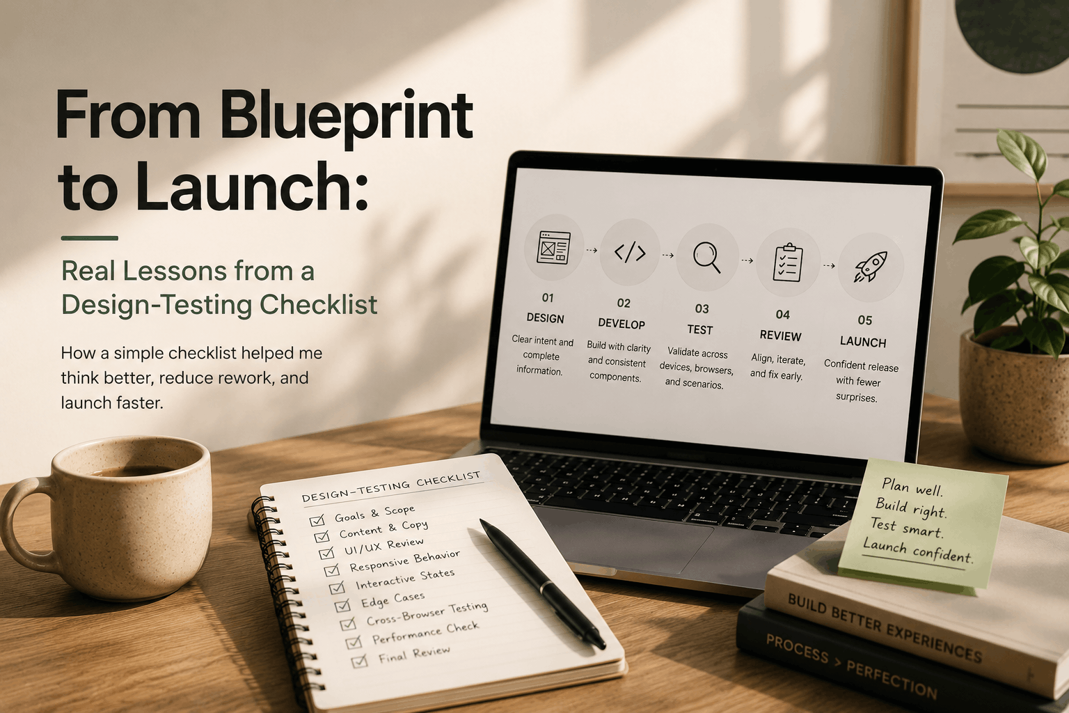
From Blueprint to Launch: Real Lessons from a Design-Testing Checklist
How working through a simple checklist changed the way I look at web design, development, and testing. While working on a Design-Testing Checklist, I started noticing something I hadn't really thought about before. A web page doesn't become “ready” just because the design is finished. There is a lot that happens between the first design and the final tested page.
I was putting together the checklist mainly to make the process easier to follow, especially when working on web pages for campaigns. But while going through the different areas that needed to be checked, I started seeing where small gaps could create bigger problems later. That was the interesting part for me. The checklist wasn't just a list of things to tick off. It made me think more about how design, development, and testing connect with each other.
Where the gaps usually start
When looking at a finished design, it is easy to think:
“Everything is there. We can start development.”
But then development starts and questions can appear. How should this section behave on mobile? What happens if the heading takes two lines? What happens when the content changes? Should this image crop differently? is this image pixelated?
These are small questions, but if they are discovered later, they can create unnecessary changes. While working on the checklist, I realized that many of these questions can be thought about much earlier. That alone can make the handoff between design and development much smoother.
I started looking beyond the visual design
One thing I found myself doing differently was looking at a design from the developer's point of view. Instead of only checking whether the page looked right, I started thinking about how someone would actually build it. For example, a design might show three cards next to each other.
That's simple on desktop. But what happens on tablet? Do they become two cards and then one? Do they become a horizontal scroll? What happens if one card has more content than the others? The design may not show every possible situation. That's where thinking ahead becomes useful.
Mobile is not just a smaller desktop
This was another area that stood out to me. When we say a page is responsive, it doesn't simply mean that the desktop design becomes smaller. The layout itself may need to change. Text may wrap differently. Images may need different cropping. Sections may stack. Buttons may need different spacing. Navigation may change completely. While thinking through the checklist, I started seeing responsive behavior as something that needs to be considered as part of the design-to-development process, rather than something to quickly check at the end.
Testing made me think about real usage
Testing also started looking different to me. It's easy to check whether a page opens and whether the main button works. But a real user doesn't interact with a page in exactly one way. They may use a different device. They may use another browser. They may have a smaller screen. They may scroll quickly. They may enter unexpected information. They may interact with elements in a different order. Thinking about these situations while creating the checklist helped me understand that testing is not only about finding bugs. It is about checking whether the experience actually holds together.
Why this matters for campaign pages
This became especially important when I thought about campaign work. Campaign pages usually have a timeline. There is a target launch date, content, design approvals, development, testing, tracking, and other launch requirements. When something is discovered very late, it doesn't always mean fixing one small thing. It can mean going back through several stages. A small UI change can lead to another development change. Then it needs to be tested again. Then someone needs to review it again. That's where time starts disappearing. The goal of the checklist was not to stop changes from happening. Changes are normal. The goal was to catch the avoidable ones earlier.
One document can make the process clearer
What I liked about the idea of the checklist was its simplicity. It gives the team a common place to look. Instead of someone asking:
“Did we check the mobile version?”
or
“Was this interaction already reviewed?”
the checklist can make those things visible.
It's a small thing, but it can reduce the amount of information people have to keep in their heads. And when multiple people are working on the same page, that matters.
I also realized that “done” means different things
This was probably one of the more interesting things I noticed. For design, “done” can mean the visual design has been approved. For development, “done” can mean the page has been implemented. For testing, “done” means the page has been checked and the issues have been resolved. All three are valid. But they are not exactly the same thing. The checklist helped me see that we need to be clear about what “done” means at each stage. Otherwise, one person may think a page is ready while another person still has important questions.
The real value is reducing back-and-forth
The more I thought about the process, the more I realized that the biggest benefit isn't actually the checklist itself. It's the reduction in unnecessary back-and-forth. If something is clear before development, there is less guessing. If responsive behavior is considered early, there are fewer surprises later. If testing areas are known from the beginning, QA becomes more focused. And if everyone understands what needs to be checked before launch, the final stage becomes less stressful. That's the kind of improvement I was looking for. What changed in the way I work I wouldn't say the checklist suddenly changed everything. It's more that it changed the questions I ask when looking at a web page.
Working on the Design-Testing Checklist made me realize that a fast development process isn't necessarily about doing every stage faster. Sometimes, it's about making sure we don't have to repeat the same work. A clear design helps development. A clear implementation makes testing easier. Good testing catches problems before launch. And better communication connects all three. That's what I found while working through the checklist. It started as a simple way to organize the process, but it gave me a better understanding of what happens between a design being approved and a web page actually being ready to launch. For me, the biggest takeaway is simple