Visualizing the Unknown: Anomaly Detection in Unlabeled Audio using UMAP
In the lifecycle of any machine learning project, the most painful phase is often the very first one: data curation. Before you can train a model to detect a dog bark, you need thousands of labeled examples of dog barks. But where do those labels come from?
In computer vision, this cold-start problem is manageable. If you scrape 10,000 images from the web, you can open a file explorer, set the view to large icons, and visually scan the dataset. The human brain is a highly parallel image processor, you can spot a corrupted image, a blank file, or an irrelevant photo in milliseconds. Teams working with audio don't have this luxury. Audio is inherently temporal and opaque. You cannot glance at an MP3 file. To understand its content, you must consume it linearly. If you have 10,000 files averaging 5 seconds each, that's nearly 14 hours of continuous listening time, just to know what data you have, let alone label it.
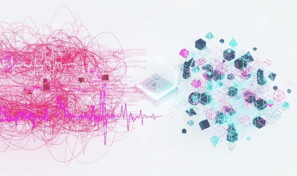
At Hoomanely, we're building advanced AI solutions to provide preventive healthcare to pet parents. To do this robustly, we rely on large-scale, real-world audio data. We faced a critical bottleneck: we had gathered a massive dataset of potential pet sounds, but we knew it was polluted with noise, TV commercials, traffic sounds, silence, and human speech. We needed a way to audit this data that didn't involve a week of manual listening. We needed to turn the temporal problem of listening into a spatial problem of looking.
The challenge: visualising the invisible
- Why is audio so hard to visualise? The waveform trap: the most basic representation of audio, a plot of amplitude over time, is semantically empty. A recording of a dog barking and a recording of a car horn might both manifest as loud, jagged bursts of amplitude, visually identical.
- The spectrogram hurdle: we often convert audio to spectrograms to train models. While spectrograms contain the information needed to distinguish a bark from a horn, they're still complex, high-dimensional images. Detailed patterns in the 200-500Hz range might distinguish a playful bark from an aggressive growl, but these subtleties are invisible to the naked eye scrolling through thousands of files.
- The dimensionality curse: to a computer, a 5-second audio clip at 44.1kHz is a vector of roughly 220,000 numbers. To make sense of this dataset, we need to compress those 220,000 dimensions down to exactly two, X and Y. If we can do that effectively, we can map our entire audio library onto a 2D scatter plot. The goal was simple but ambitious: proximity in the plot must equal semantic similarity in the real world.
The landscape of solutions
We evaluated three primary techniques for exploring this high-dimensional structure. PCA, principal component analysis, the old guard of dimensionality reduction, works by rotating the dataset to find the axes that capture the most variance. The problem: PCA assumes data lies on a linear plane, but complex real-world data like audio embeddings usually sits on a non-linear manifold. When PCA tries to flatten this crumpled ball, it smashes distinct layers together. In practice, our PCA plots just looked like one giant, amorphous blob.
t-SNE, t-distributed stochastic neighbour embedding, has been the standard for visualising high-dimensional data in academic papers. It calculates the probability of two points being neighbors in high-dimensional space and tries to match that probability in 2D. The problems: it's slow, scaling poorly with large datasets, and it has a global structure issue, t-SNE focuses so obsessively on local neighbors that it often loses the big picture. Two clusters might appear on opposite sides of the plot, but that doesn't necessarily mean they're very different, it just means t-SNE put them there to make space. This unreliability made it dangerous for anomaly detection.
UMAP, uniform manifold approximation and projection, is the modern solution. Like t-SNE, it constructs a graph of neighbours, but it uses a simpler mathematical foundation that allows it to optimise the layout much faster. Why we chose it: speed, it runs significantly faster than t-SNE, allowing us to iterate quickly. Balance, it's the Goldilocks solution, capturing the tight local clusters of t-SNE while preserving the global structure of PCA.

Our approach: the manifold pipeline
To solve our data quality and curation problem, we built a specific pipeline combining deep learning feature extraction with UMAP visualisation.
- Step 1, semantic vectorisation, the ear: you cannot feed raw audio waveforms into UMAP, the raw data is too noisy. We used a pre-trained audio encoder, models like VGGish, CLAP, or AudioMAE, trained on millions of YouTube videos to understand sound. We stripped off the final classification layer and kept the penultimate embedding layer, converting each file into a dense 1024-dimensional vector. This vector is a semantic summary, the model compresses the texture of the sound, timbre, pitch, rhythm, into a set of numbers.
- Step 2, manifold projection, the map: we fed these vectors into UMAP. We found hyperparameter tuning was critical, n_neighbors set to 15 helped us fragment the data into many small, tight micro-clusters rather than one big continent, and min_dist set to 0.1 allowed points to pack tightly together, creating clear empty space between different types of sounds.
- Step 3, interactive exploration, the tool: the final piece was interactivity. A static image of dots is interesting but not actionable, you can't debug what you can't check. We built a lightweight web-based visualisation tool where each point on the scatter plot was linked to the underlying audio file, hover to see filename and metadata, click to play the audio, lasso to select a group of points and export their IDs to a CSV.
Results: cleaning the dataset
The moment we loaded our data into this tool, the unknown became known. We saw our data form distinct islands. The main landmass, most of the data formed a large connected continent, our high-quality pet sounds. The silence island, a tight, dense pinprick of points far away from everything else, files where the audio trigger failed, resulting in 5 seconds of digital zero. The glitch cluster, a stringy, scattered group of points that turned out to be corrupted audio files sounding like static or screeching. The human peninsula, a cluster attached to the main landmass but extending outwards, clips of pets with owners talking loudly over them.
The action: instead of listening to 10,000 files, we simply lasso-selected the silence island and the glitch cluster and deleted them. In about 10 minutes of visual work, we removed a significant part of our dataset that was garbage.
Key takeaways
- Data curation is engineering.
- Don't outsource data cleaning, building tools to visualise your data is high-leverage engineering work.
- Embeddings are universal.
- You don't need labeled classes to start using deep learning, use pre-trained embeddings to structure your chaotic data before you start your own training.
- Visual debugging beats manual auditing.
- Whenever possible, transform a linear, manual task into a parallel, visual task, the human eye is the fastest outlier detector in the world, give it a map to look at.
- The best model architecture in the world cannot fix a dataset full of noise.
- See your data first, train second.