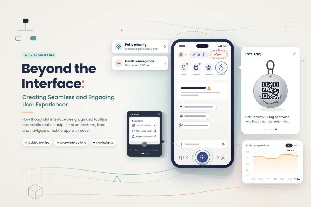
Beyond the Interface: Creating Seamless and Engaging User Experiences
A feature only helps people if they can find it. It's easy to spend weeks building something useful, test that it works, and ship it, only to realise that new users walk straight past it. That gap between what an app can do and what users actually discover is where guided experiences earn their place. Interactive tooltips, thoughtful onboarding and purposeful animations turn a screen full of icons into something people understand.
Working on onboarding for a Flutter mobile app showed me how much that gap matters. Along the way, I also had to dig into our animation assets, edit their JSON source files and follow the project's rules for bringing animations into the app. This post covers what that work taught me.
Why guided onboarding matters in mobile apps
Think about the first time you open a new app. There are icons you don't recognise, a navigation bar with several options and no obvious place to start. Most people tap around for a few seconds, and if nothing clicks, they leave.
A well-designed onboarding flow changes that first impression. Interactive tooltips highlight one part of the screen at a time and explain it in a sentence or two. Instead of expecting users to work everything out alone, the app walks them through it, step by step.
On mobile, this guidance has to feel natural rather than forced. Good tooltips:
- appear at the right moment, not all at once
- point to the correct element, even on different screen sizes
- let users explore the app instead of blocking it
The real goal isn't to explain every button. It's to help people feel confident using the app from their very first session.
Bringing tooltips to life with Lottie animations
Animation makes guidance more engaging, but only when it has a job to do. A small movement can draw the eye to a new feature, show how a gesture works or make a transition feel less abrupt. Motion for its own sake does the opposite and pulls attention away from what matters.The tooltips in our app use Lottie animations. Lottie plays lightweight, vector-based animations inside a Flutter app, so designers can create rich motion without developers rebuilding every frame in UI code. Working closely with these assets showed me that animation design and app behaviour can't be treated separately. An animation can look perfect in a preview and still feel wrong inside the app. It has to fit the screen, match the purpose of its tooltip and play reliably every time it appears.
How the animation asset workflow fits together
One of the more technical parts of this work was learning how the project manages its animation files. Each animation moves through three stages:
- JSON source files hold the editable animation data and are kept in the project as the source of truth.
- Converted
.lottiefiles are generated from those sources and shipped as the runtime assets the app actually loads. - Code references follow the project's naming and integration conventions, so each tooltip loads the right asset.
Seeing this pipeline end to end changed how I approached changes. An animation isn't an isolated file you swap in and forget. Editing the JSON source is only the first step; the converted asset and its reference in code have to stay in sync too. The lesson was simple but important: a change isn't finished when the source file is edited. It's finished when the result works correctly inside the app.
Taking alternative way without replacing design
One of the most valuable parts of this work was finding out what I could handle directly as a developer. Instead of waiting on a manual handoff for every small, implementation-level adjustment, I explored the code and animation files to see how they were structured and where each change belonged.
That doesn't mean developers should take over design. Visual style, animation timing, motion quality and consistency across the app still depend on thoughtful design decisions and real collaboration.
What developers can own is the technical side: understanding existing assets, making source-level changes when the requirements are clear and checking those changes against the project's conventions. The skill is knowing three things: what is safe to change, what needs testing and when it's time to bring a designer in.
Key lessons for building better onboarding
- Understand the existing system first. Learning the project's conventions before changing anything saves a lot of rework.
- Treat animation assets as part of the architecture. Source files, converted assets and code references each play a distinct role.
- Design for the user, not just the implementation. A feature should make the app easier to understand or use.
- Own the technical investigation. Many implementation questions can be answered by exploring the existing code and assets.
- Know when to collaborate. Independent problem-solving works best alongside clear design requirements and proper validation.
Conclusion
Mobile development isn't only about building features. It's about making those features easy to understand, accessible and enjoyable to use. A tooltip may take up only a small corner of the screen. Yet the thinking behind its timing, animation and behaviour can shape how someone feels about the whole app. This work connected the experience users see with the technical decisions behind it. It also showed the value of understanding an existing animation workflow and taking a more proactive approach to development challenges.