Designing Form Language That Defined Everbowl
How thoughtful choices in color, material, finish, and light shaped Everbowl's identity long before its technology came to life.
Introduction
When people pick up a product for the first time, they don't start by evaluating its spec sheet. They make an almost instant judgment based on what they see, touch, and feel. Before the electronics power on, before a single sensor collects data, the product has already told them something about itself.
Working on Everbowl, we realized its appearance wasn't just an aesthetic afterthought. It was an engineering decision that shaped how people perceived quality, trust, and purpose. Every choice around color, texture, finish, and how a surface felt in the hand fed directly into the product's identity, and that meant appearance had to develop alongside the engineering, not get bolted on after it was done.
Why form language matters in product design
Form language gets dismissed sometimes as styling or decoration. It's really the visual vocabulary that tells someone what a product is for before they've touched it. For hardware, that means answering questions like: does this look approachable? Does it look durable? Does it belong in a home or a warehouse? Does it feel premium or disposable?
People form those impressions in seconds, and those seconds shape everything after. For Everbowl, which lives in someone's kitchen or living room, the design needed to fit into that space rather than compete with it.
Defining what "premium" meant for Everbowl
A lot of consumer pet products lean on bright plastics, glossy finishes, and high-contrast colors to grab attention. They look striking, but they often read as toys rather than home appliances.
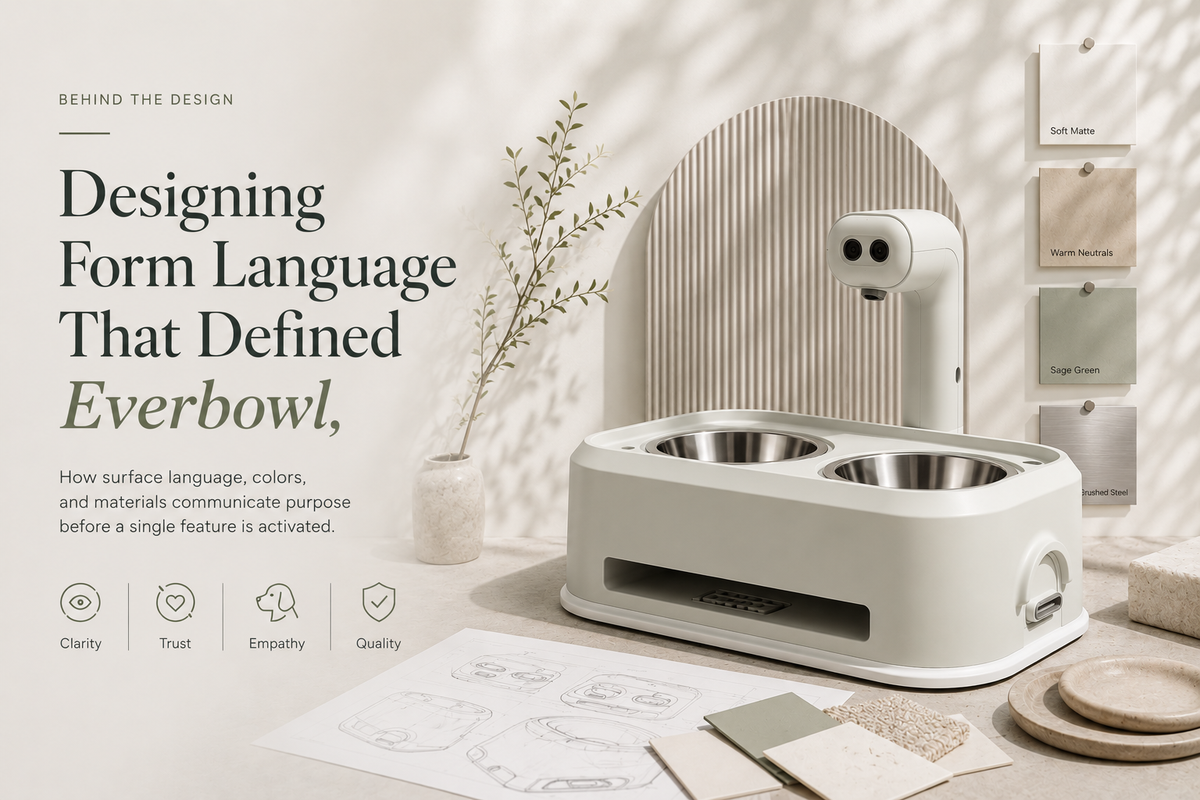
We wanted the opposite: something that felt like a thoughtfully designed household object rather than an electronic gadget dropped into your kitchen. That pointed us toward a quiet-luxury design philosophy: neutral colors, minimal visual clutter, matte finishes, texture over gloss, and material quality doing the talking instead of logos or reflective surfaces. We wanted the materials themselves to communicate craftsmanship, not a badge on the side.
Selecting colors that blend into everyday spaces
Color wasn't chosen off a trend board or personal taste. It came from context. Everbowl spends its life in kitchens, dining areas, and living rooms, surrounded by furniture, flooring, cabinetry, and whatever natural light happens to be in the room.
There was a practical payoff too. Compared to glossy white or black, the matte neutral tones hid dust, fingerprints, minor scratches, and everyday wear far better, so the product kept looking clean with a lot less upkeep.
Surface finish is more than appearance
Color grabs attention first, but texture is what shapes how someone judges a product over time. How something feels under your fingers matters almost as much as how it looks. Instead of one finish for the whole product, we treated each surface according to what it actually needed to do.
Food bowl: needed the smoothest finish we could get, mainly for easier cleaning, less food residue, and better hygiene. Lower roughness means fewer places for contaminants or biofilm to collect.
Lens bezel: a different problem entirely. Instead of texture, the bezel got a polished SPI-grade surface that suited the camera assembly and kept a refined look around the optics.
Main housing: this is what actually defines Everbowl's look. Instead of specifying roughness the way a standard VDI finish would, we used a Mold-Tech (MT) texture, which creates deliberate tactile patterns that feel warmer and more organic than a plain rough surface. This ended up being one of the defining traits of the product's industrial design.
Wand: a frequent contact point, so it got a medium VDI texture, enough to improve grip without feeling aggressive in the hand.
There was no single "premium finish" we slapped on everywhere. Each one earned its place based on what that surface was actually for.
Engineering insight: Premium products rarely use the same finish on every surface. Each interface gets designed around how people actually interact with it, whether that's handling, cleaning, viewing, or food contact. Function should drive the finish choice, not the other way around.
Designing with light as a material
As the design matured, light became just as important as color or texture. We stopped treating lighting as an electronic feature bolted on after the enclosure was finished and started thinking of it as part of the material system.
The same light behaves completely differently depending on the surface around it. Glossy plastic throws sharp reflections and visible hotspots. Matte, textured surfaces diffuse light into something softer and more ambient. Designing the housing texture alongside the lighting path meant the light complemented the product instead of fighting it, which gave the whole thing a calmer, more integrated feel.
Form language influences perceived quality
None of these choices changed how the product actually performed. Same sensors, same electronics. But how people perceived it changed a lot. People consistently described it as cleaner, more refined, better suited to a home, and more trustworthy, and none of that came from a spec sheet. It came from design choices that lined up with the product's actual purpose.
People experience a product long before they ever get around to evaluating its features, and that's really the core of industrial design.
Form language is an engineering decision
It's tempting to push appearance decisions to the end, since a prototype works fine regardless of its color or texture. But delaying those decisions usually creates compromises you didn't need to make. Surface texture affects mold design. Paint systems affect manufacturing. Material choice affects durability. Lighting integration changes the enclosure geometry itself.
Bringing form language in early meant these were engineering decisions from the start, not cosmetic patches at the end. The appearance and the function grew up together instead of one following the other.
How this shows up at Hoomanely
At Hoomanely, product design doesn't stop at function. Building Everbowl showed us that engineering and industrial design can't really be separated when you're building something meant to live in someone's home. The choices we made in color, texture, finish, and lighting helped create a device that performs reliably and also feels like it belongs where it sits. That's shaped how we think about every product we build for daily life since.
Key takeaways
- Form language shapes how people perceive a product before they've experienced a single feature.
- Color selection should respond to the product's actual environment, not a trend.
- Different surfaces on the same product need different finish strategies, based on function.
- Mold-Tech, VDI, and SPI finishes each solve a different engineering problem.
- Lighting should be designed alongside materials, not added on afterward.
- Industrial design pays off a lot more when it's part of engineering from the start, not a step tacked on at the end.
Conclusion
One of the more valuable lessons from Everbowl was realizing a product's identity gets built long before it's ever switched on. People don't separate engineering from design in their heads. They experience both at once. Every texture, every transition between materials, every color choice tells someone something about the product before a single sensor has recorded any data.
Building form language into the engineering process, instead of treating it as a finishing step, gave us a product that feels cohesive and actually belongs in the spaces it was designed for. A good product doesn't just perform well. It tells you what it's for through every surface, well before the technology inside it ever turns on.