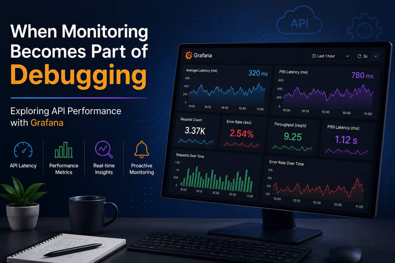
When Monitoring Becomes Part of Debugging: Exploring API Performance
When I first started working with Grafana, I treated it like a collection of graphs. I could see request counts, latency, error rates, and dozens of other metrics, but I didn't really understand what they were telling me. Every panel looked useful on its own, yet I found it difficult to connect them into a complete picture.
Instead of simply displaying numbers, the dashboard forced me to think about how an API behaves over time and how different metrics relate to one another. It also changed the way I approached debugging.
Building More Than Just a Dashboard
At first, the task sounded straightforward: create a dashboard that displays API metrics. As I explored Grafana, I realized the bigger challenge wasn't building the panels it was deciding which metrics actually mattered. An API can expose hundreds of metrics, but not all of them help when you're investigating a performance issue. Showing everything on one dashboard only makes it harder to understand what's happening. The goal became building something that could answer questions instead of simply displaying data.
Looking Beyond Average Latency
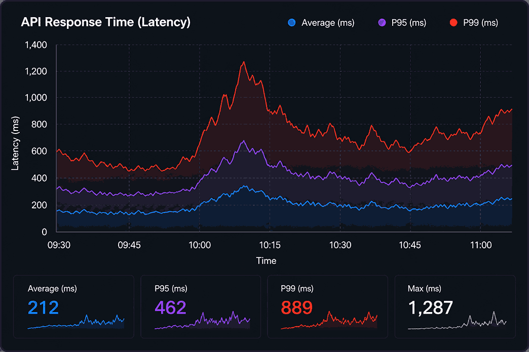
One of the first metrics I looked at was average latency. Initially, it seemed like a reasonable indicator of performance. If the average response time looked healthy, I assumed everything was working well. Later, I learned that averages can hide important details. Imagine an API receives thousands of fast requests but a small percentage suddenly become much slower. The average may barely change, even though some users are experiencing noticeable delays. That's where percentile metrics became much more useful.
P95 and P99 latency show how the slowest requests behave instead of focusing only on the average. Seeing those metrics together made it much easier to identify performance spikes that would otherwise go unnoticed.
Connecting Metrics Instead of Reading Them Separately
Another thing I learned was that individual metrics rarely explain a problem on their own. For example, an increase in latency doesn't automatically mean the backend has become slower.
It could be caused by:
- Increased request volume
- Higher error rates
- Infrastructure issues
- Backend processing delays
- Network bottlenecks
Looking at request count, latency, throughput, and error rate together provides much better context than looking at each graph individually. Once I started correlating metrics instead of reading them independently, the dashboard became much more useful.
Monitoring Changes the Way You Debug
Before working with Grafana, I mostly thought about debugging in terms of logs. Logs are still important, but they usually tell you what happened after you've identified a problem. Monitoring works differently.
It helps answer questions such as:
- When did the issue start?
- Was traffic increasing at the same time?
- Did latency rise before error rates increased?
- Is this affecting every request or only a small percentage?
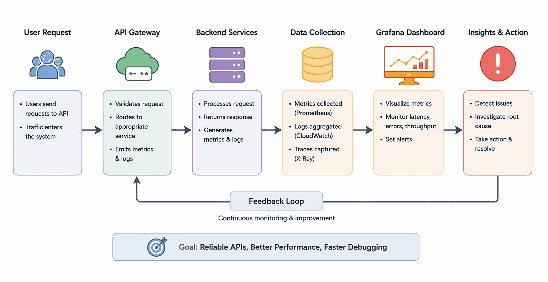
Instead of jumping directly into application logs, monitoring provides the context needed to narrow down where to investigate first .That shift made debugging feel much more structured.
Building a Dashboard That Answers Questions
One lesson I didn't expect was that dashboard design matters just as much as the metrics themselves. A dashboard filled with charts can quickly become overwhelming. Organizing related metrics together made it much easier to understand API behaviour at a glance. The final dashboard focused on a few core signals:
- API latency
- Request volume
- Error rate
- Throughput
- Percentile latency (P95)
Keeping the dashboard focused made it more useful during troubleshooting instead of simply acting as a reporting screen. Monitoring Request Volume
Request count provides context for almost every other metric. A latency value by itself does not explain whether the API is handling ten requests or thousands of requests. A response time increase during high traffic may have a different cause from the same increase during low traffic. Tracking request volume also helps identify unusual behaviour. A sudden drop in requests may indicate that users cannot reach the API, an upstream service has stopped sending traffic, or a deployment introduced a routing issue. A sudden increase may represent genuine traffic growth, repeated retries, bot activity, or a frontend issue generating duplicate requests. This is why request count should not be treated as only a usage metric. It can also support debugging.
What I Took Away
Working on this dashboard changed the way I think about monitoring. It's easy to assume dashboards are only for displaying graphs, but they're actually tools for understanding system behaviour. The experience also helped me appreciate that good monitoring isn't about collecting more metrics it's about collecting the right ones and presenting them in a way that supports faster investigation.
Building this dashboard changed the way I approach API performance. Instead of treating monitoring as something to check after an issue appears, I now see it as an essential part of understanding system behaviour and narrowing down problems before diving into logs. It completely changed how I think about debugging production systems.